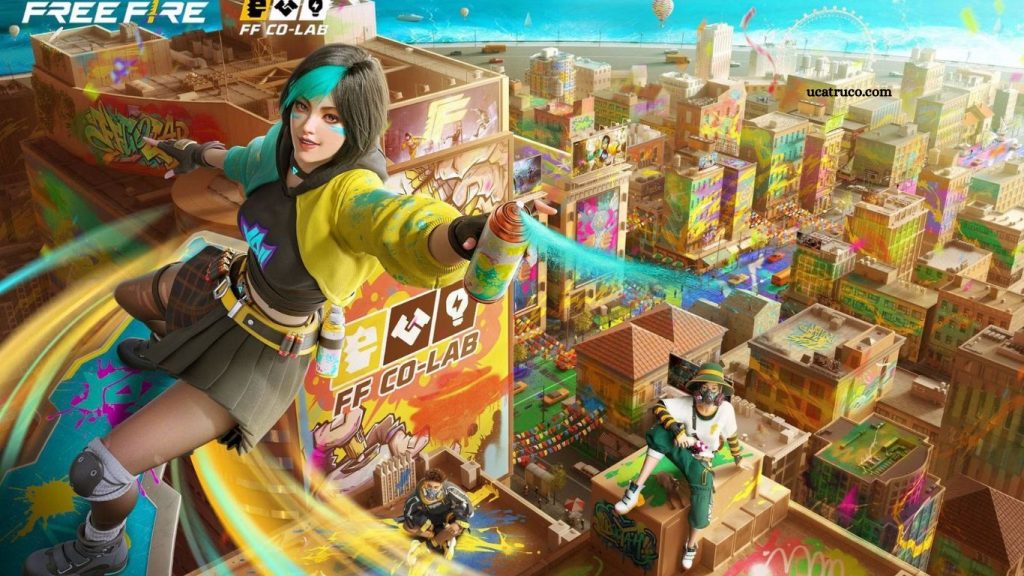
Free Fire, one of the most popular battle royale games globally, recently unveiled a new logo. This redesign marks a pivotal moment for the brand as it continues to evolve in a competitive gaming landscape. The new logo is more than just a visual update; it reflects the game’s identity, philosophy, and future ambitions.
In this article, we explore the meaning, concept, and design changes behind Free Fire’s new logo, analyzing its impact on the gaming community, branding strategy, and user experience.
Read More: Free Fire News: Latest Leaks, Events, and Patch Information
The Evolution of Free Fire’s Logo
From Classic to Contemporary
Free Fire has undergone several visual transformations since its launch. Each logo redesign aimed to align with the game’s growing popularity and evolving aesthetics. The original logo symbolized raw energy and adventure, appealing to early adopters.
With the latest redesign, Free Fire has embraced modern graphic design principles, offering a more polished and dynamic visual identity. The new logo is designed to resonate with both long-time fans and new players, reflecting the game’s maturity and global reach.
Key Milestones in Logo Design
- 2017-2019: The original logo with a flame icon, representing action and intensity.
- 2019-2022: Simplified typography emphasizing clarity and boldness.
- 2025: New logo unveiling with contemporary aesthetics, smoother lines, and symbolic elements that represent resilience, teamwork, and competitive spirit.
Concept Behind the New Logo
Symbolism and Meaning
Every element of the new Free Fire logo carries meaning:
- Flame Iconography: The flame symbolizes energy, courage, and the unyielding spirit of players.
- Modern Typography: The updated font style is sleek and angular, representing agility and precision.
- Color Palette: The choice of fiery colors conveys passion, excitement, and intensity, while gradients create a sense of depth and dynamism.
The overall concept reflects Free Fire’s commitment to community engagement, competitive gaming, and immersive gameplay experiences.
Philosophy Behind the Redesign
The redesign was not merely aesthetic—it aligns with a strategic vision:
- Global Appeal: Ensuring the logo resonates across diverse cultural markets.
- Digital Adaptability: The logo is optimized for digital platforms, including mobile, web, and social media.
- Player-Centric Design: The logo reflects the core values of Free Fire players: teamwork, strategy, and resilience.
Design Changes Explained
Typography
The typography in the new logo is modern, minimalistic, and bold. Every letter is crafted for readability, scalability, and impact. This design approach ensures the logo is easily recognizable, even in small digital formats.
Iconography
The flame icon underwent significant refinement. It now features smoother curves, a three-dimensional gradient effect, and sharper edges to convey movement and energy. This modernized flame complements the dynamic nature of Free Fire gameplay.
Color Palette
The new color scheme is vibrant, incorporating fiery oranges, deep reds, and subtle yellows. These colors are associated with passion, energy, and action—values core to Free Fire’s gameplay.
Versatility
The new logo is adaptable across multiple platforms. Whether displayed on mobile screens, social media banners, or merchandise, it maintains clarity, consistency, and visual appeal.
Impact on the Free Fire Community
Player Reactions
Since the unveiling, the Free Fire community has expressed excitement and curiosity. Many players appreciate the modern aesthetics and symbolic meaning behind the new logo.
Brand Perception
The redesign strengthens Free Fire’s brand positioning, making it appear more professional, innovative, and globally relevant. A modern logo contributes to better recognition and credibility in the esports and gaming industry.
Frequently Asked Questions
What is the new Free Fire logo?
The new Free Fire logo is a modern redesign that combines sleek typography with a refined flame icon. It reflects energy, agility, and the competitive spirit of the game, offering a fresh look that resonates with both new and long-time players.
Why did Free Fire change its logo?
Free Fire updated its logo to modernize its brand identity, appeal to a global audience, and align with digital-first platforms. The redesign also symbolizes the evolution of the game and its focus on player engagement and community values.
What does the flame in the Free Fire logo represent?
The flame symbolizes energy, courage, and the unyielding spirit of Free Fire players. Its dynamic design conveys movement, intensity, and the thrill of battle royale gameplay.
How does the new logo affect the Free Fire brand?
The new logo strengthens Free Fire’s global brand image, making it appear more professional, innovative, and player-focused. It improves recognition, builds credibility, and creates a stronger connection with the gaming community.
What colors are used in the new Free Fire logo, and why?
The logo features fiery oranges, deep reds, and subtle yellows. These colors evoke passion, energy, action, and excitement, which align perfectly with the fast-paced gameplay of Free Fire.
Will the new logo appear in the game itself?
Yes, the updated logo will be featured across in-game menus, promotional materials, social media pages, and official merchandise. It is designed to maintain consistency across all platforms.
Conclusion
The new Free Fire logo is more than a simple visual update—it is a bold statement of the game’s growth, innovation, and connection with its global community. Every element, from the refined flame icon to the modern typography and vibrant colors, has been carefully crafted to reflect energy, agility, and the competitive spirit that defines Free Fire.

